3 Questions to Ask When Building a KPI-Driven Decision Support System
Written by: Anabel Chuinard, PhD
Key Performance Indicators (KPIs) and KPI dashboards are extremely popular in the private sector. Designed to help monitor performance and measure progress towards a set of goals, they are now finding increasing usage among government agencies. Many metropoles around the world, from London to Rio De Janeiro, have developed and adopted indicator projects, seeking to monitor various aspects and parts of the city to facilitate the deployment of solutions and services.

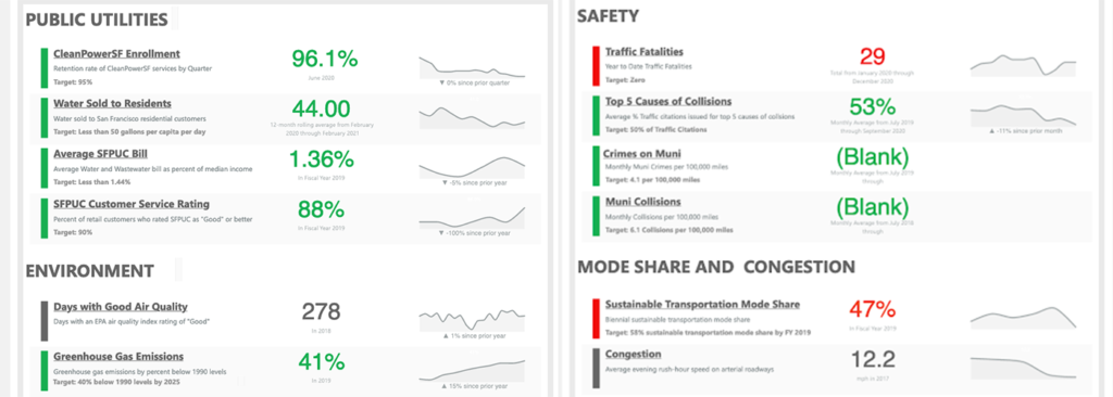
Performance scorecards developed by the City of San Francisco in May 2020
Source: https://sfgov.org/scorecards//
Used as a suite of barometers of city performance and trends, KPIs can simplify the decision-making process and guide policy formulation towards a higher quality of services, sustainability, competitiveness, quality of life, and more. When used to analyze gaps in performance across various areas, KPIs can also help public sector leaders identify effective programmes and drive policy changes.
There are different types of urban indicators that vary in how they are constructed and used. Some indicators consist of the measurement of a statistic related to a single factor, for instance, the number of health facilities in a given region.
Most, however, combine several data inputs to account for multidimensional phenomena that cannot be captured with a single measure. An indicator representing the level of safety of a street for cyclists, for example, would typically derive from a formula accounting for multiple factors such as the quality of the biking infrastructure: the presence of bike lanes, signalization etc, and the expected motorized traffic on the street.
When designing a data-driven decision support system (DSS), it is not always simple to integrate and analyze these multiple contextual factors and data inputs together. UrbanLogiq has years of experience dealing with the complexity of collecting and collating data from various sources. Deriving comprehensive and actionable analytics on top of those data layers has become one of our core competencies.

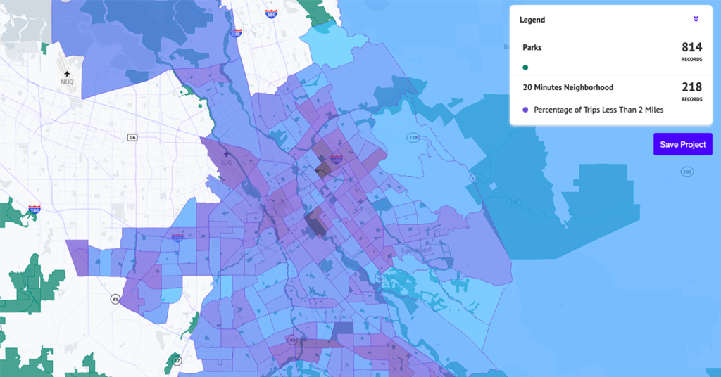
UrbanLogiq’s map view of short trips across census tracts
Credit to UrbanLogiq’s data science team, below are three questions to ask when building an effective KPI-driven decision support system.
1. Are my KPIs properly normalized?
Being able to compare the same KPI at different points in time or across different areas is essential, but it only makes sense if such a KPI is properly normalized, and ideally, scaled.
Normalization is an operation that consists of adjusting a statistic such that the result depends as little as possible on external factors that are not directly related to what we are trying to measure.
What does this mean in practice?
Let’s say we want to measure car usage in various neighborhoods. We could choose to count the number of owned vehicles in each area and use those counts as a proxy for car usage. However, higher population density neighborhoods would statistically have more owners than less populous ones. We may have the false impression that urban areas are more inclined to using cars than rural ones. One way to alleviate this effect is by evaluating ownership in proportion with the population, i.e., tracking the number of cars owned per capita.
Normalizing is not always as simple as dividing by population in each area. However, once it is clear which effects are to be measured and which ones should be taken out of the equation, it generally becomes easier to determine how to appropriately normalize a metric.
2. Are my KPIs reflecting performance?
Another important step to consider is the consistent scaling of indicators. Do high values of the KPIs indicate high performance, or is it inversely proportional?
It often makes sense to convert all indicators into scores to help pinpoint the areas of higher and lower performance, and evaluate success according to the same standards, to allow comparison across regions, for instance, on a map.

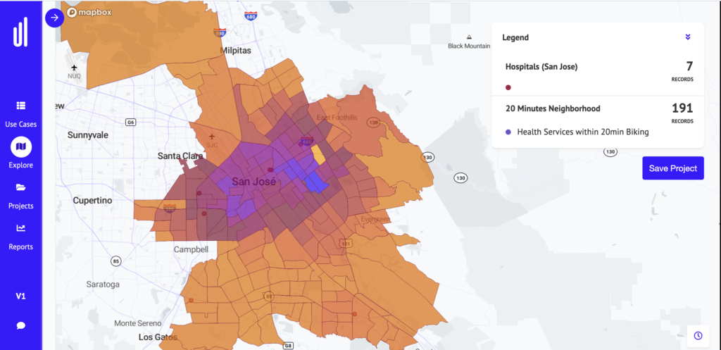
UrbanLogiq’s map view of health service accessibility by bike across census tracts
If you were to measure a city’s performance in reducing its global carbon footprint, you could use the number of owned internal combustion engine (ICE) vehicles per capita as a proxy. However, this statistic scales as the inverse of performance: higher ownership rates typically amount to higher greenhouse gases (GHG) emissions. It makes more sense in this case to construct a GHG emission score that would be maximized in the areas where ICE vehicles ownership per capita is reduced, and minimized in regions where the appetite for such vehicles is important.
3. Where are the biases in the calculation?
Any statistic is subject to misrepresentation. The quality of the data depends on how accurately and faithfully it matches reality, as well as how clean (error and gap-free) and consistent it is.
When building a new indicator it is crucial to check that the data entering its composition is as valid and reliable as possible. In particular, it is important to consider the following aspects:
- Scarcity: Are there enough data points at your disposal to significantly represent a situation? When analyzing statistics across various geographic areas, one should always ensure that the input dataset covers all of the regions of interest adequately. If, for instance, a police precinct does not record crime events through the same platform others use, their crime counts may not be captured appropriately in the data and the safety indicator in their district may end up being overestimated.
- Variation in measurement methods: The way the data is collected may vary across time and locations. The number of COVID-19 cases, for instance, is a broadly shared and used indicator across governments. Being directly derived from the number of tests taken, this indicator is sensitive to local testing policies and practices, which makes comparison across regions difficult without an understanding of the individual context.
- Anomalies: Sometimes a single erroneous data point can have a massive impact on a KPI. Think ‘mistakenly adding a zero at the end of an already big number.’ When building KPIs from human-recorded data sources in particular, it is highly recommended to look for possible anomalies to avoid introducing skewing effects down the line.
Often, such biases are irreducible. In this case, it is essential to be as transparent as possible. KPI scorecards should always be paired with some information on existing inherent biases and limitations in the data, including an explanation of the context within which they were calculated.
Our work would be easy if we could simply concentrate on a handful of all-encompassing scores to help decide where to put our next efforts. It is tempting to build a composite score to represent the quality of life in a neighborhood. This would combine various factors such as infrastructure quality, number of green spaces, affordability of housing, number of jobs available and much more, and would help us identify enjoyable neighborhoods from less enjoyable ones at one glance. How great!
There are two main reasons why this can be risky. The first one is that composite KPIs are subject to complex biases and errors, simply because they combine various data inputs, all with their own biases and limitations. The more we aggregate different information sources, the more difficult it becomes to interpret where uncertainties on the result come from. Simpler variables are usually safer to use as they are easier to interpret and derive specific actions from.
The second reason is tied to our own interpretation biases. If we can all agree on the factors that make a good neighborhood, it is harder for us to quantify which factors are more important than others. The relative weightings we impose on these factors can have a profound effect on the final result. The choice we make on the weighting is unfortunately often subjective.
In such a context, it is safer to consider using more basic indicators to support the decision process than relying on a single ‘oracle number’. So…
When in doubt, keep it simple
The multiple, complex, interdependent nature of cities means having a clear political and contextual understanding of each situation is essential for city managers, planners, and public sector leaders to make the best of urban indicators.
At UrbanLogiq, we help agencies better measure, manage and benchmark projects and initiatives. Through data integration, visualization, and analytics, we enable public officials to analyze and derive actionable insights from siloed, diverse, or complex data without labour-intensive manual data processes.
Want to learn more?
See what UrbanLogiq can do for your agency. Contact us today to speak with someone from our team, or to schedule a personalized demonstration of the UrbanLogiq platform in action.


